Repose Gray
(SW 7015)
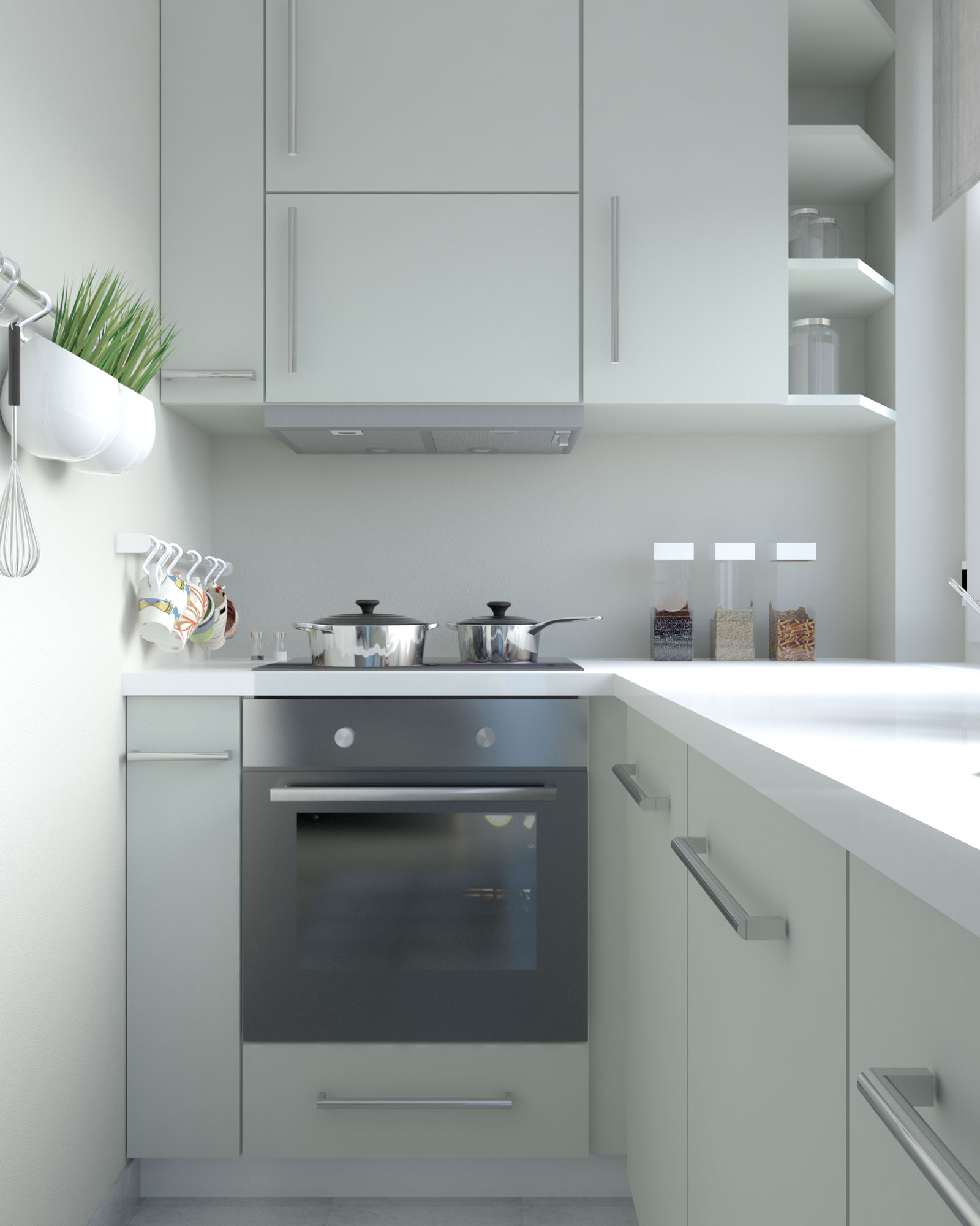
With an uncanny ability to strike the perfect balance between warm and cool tones, Repose Gray by Sherwin Williams transcends design styles and effortlessly elevates any room, especially when it is used to paint the walls. And that’s the main reason why this greige paint color is very popular among homeowners and interior designers.
Kitchens, where warmth and togetherness are paramount, are an ideal place for Sherwin Williams Repose Gray to unleash all of its potential. It wraps the space in a comforting embrace, inviting people to gather and connect.
So, you’ve painted your walls with Repose Gray, but how about the cabinets?
Based on our journey through the intricate world of interior design, it’s clear that for kitchens adorned with the timeless elegance of Repose Gray walls, the ideal cabinet paint colors are clary sage (SW 6178), sea salt (SW 6204), gray matters (SW 7066), and warm stone (SW 7032). Those soft paint colors infuse your kitchen with a subtle and soothing ambiance, and when combined with repose gray walls, they will form a kitchen space that feels both fresh and cozy.
Keep reading as we dive deeper into all of those awesome paint colors.
Sherwin Williams’ Clary Sage and Repose Gray are a match made in muted neutral lovers’ hearts. Together, these soothing hues create a calming, inviting, and serene ambiance.
The clary sage adds a hint of color and enriches the space while still keeping the neutral flawless alongside the walls.
To enhance this tranquil combo, consider incorporating neutral textiles and accessories, allowing for a naturally curated look that seamlessly integrates with the subdued palette.
With a beautiful soothing blue-gray hue mixed with a hint of green undertone, this coastal-inspired hue not only exudes plenty of brightness but also adds a unique, rich visual to make the kitchen feel more alive without overwhelming it.
The neutrality of the repose gray paint color works as a perfect canvas that helps highlight the subtle richness of the Sea Salt and make the cabinets stand out.
This beautiful combination not only breathes life into the kitchen but also establishes a welcoming and visually engaging environment that captures the essence of coastal charm.
If you want to create a stylish, monochromatic gray kitchen, then this can be a great coordinating color option. Gray matters had a bit darker tone compared to repose gray, thus still providing enough contrast that will prevent your kitchen from looking monotonous.
Furthermore, combining the warm gray walls with cool gray cabinets can be a great way to achieve a well-balanced aesthetic, exuding both warmth and sophistication at the same time.
To break the monotony, you can add more contrast by using white or black countertops, and vibrant backsplashes.
Another great bold yet neutral paint color that you need to try. Unlike most browns, warm stone possesses a remarkable level of neutrality that makes it blend flawlessly with the repose gray. At the same time, the bold tone of the warm stone cabinetry will stand out easily, and become the kitchen’s main focal point.
The combination of warm stone and repose gray adds depth and character to the space, establishing a visually compelling environment. This pairing can work even better inside any modern contemporary or minimalist style kitchen design.
If you are looking for a stunning dark paint for your kitchen cabinets, then we highly recommend this option. The tricorn black provides a bold contrast against the walls, easily producing a visually compelling and modern aesthetic. This combination adds a touch of drama to your space, while also serving as a powerful focal point.
To make the black-painted cabinetry look even better, add an even stronger contrast by using white marble countertops or white subway tile backsplash.
This option goes beyond being just a color; it embodies a distinct Nordic-style blue that possesses the power to effortlessly elevate the overall aesthetic of your kitchen.
With stronger neutrality compared to any typical blue shades, Scanda by Sherwin Williams can easily blend with almost any wall color, including our Repose Gray walls.
This gorgeous hue not only graces your cabinets, but it can also add a splash of captivating color and introduce a touch of Scandinavian-inspired sophistication.
Add an elegant splash of colors to your kitchen by using this beautiful option. When paired alongside the Repose Gray walls, the Tigereye-painted cabinets create a dynamic visual aesthetic, injecting a burst of energy and personality to lift the kitchen’s ambiance.
This pair also promotes a sense of warmth and comfort, transforming the kitchen into an inviting hub for culinary creativity and social gatherings.
Another great bold option that we highly recommend is this Indigo Batik by Sherwin Williams. This deep, navy hue instantly adds a bold elegance wherever it’s used.
The contrast between the Indigo Batik cabinetry and Repose Gray walls creates a visually striking yet harmonious balance, giving your kitchen a sense of depth and character. This awesome combination will work amazingly inside any modern, contemporary style kitchen.
Lift up the mood of your kitchen space by painting the cabinets with Goldfinch. The Goldfinch cabinet will look even better when combined with a neutral backdrop, such as the Repose Gray walls, making it feel richer and more alive.
Embrace the transformative power of Goldfinch to infuse your kitchen with a radiant charm that transcends the ordinary, making it a space that radiates positivity and style.
Going with extra white is not only an obvious fail-safe choice but also helps create a bright and sleek kitchen that embraces the minimalist aesthetic.
The pristine appeal of the sleek white cabinets helps highlight the warm tone of the Repose Gray, making the walls look charming and cozy, and helping transform the kitchen into a welcoming and inviting space.
This can also be a timeless choice that easily stands out against the changing design trends in the future.

 Andre A | Founder
At Roomdsign, we lives and breathes interior design and home decor. We are committed to sharing knowledge, insights, and inspirations with our global audience through engaging and informative blog posts.
We also empower readers with our practical tips, design trends, and imaginative ideas for a stylish and functional living spaces.