Pure White
(OC-64)
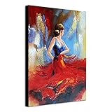
Red can bring life to your home like a spark of fire. It’s a bold color that can turn a dull room into an exciting place to be. Red accents add warmth and energy, making your space feel lively and unique.
But red isn’t as common as other bright colors like yellow. Why? It can be tricky to use well. If you don’t pair it right, red can overpower a room.
The key is to match red with the right wall colors. Our designers suggest white, gray, light pink, soft yellow, or sky blue walls when using red decorations. These colors work like a perfect backdrop, letting the red shine without being too much.
They balance out red’s boldness, creating a look that’s both striking and pleasing to the eye. Let’s explore these great wall color options in more detail.
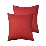
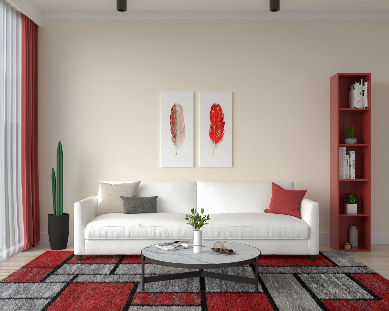
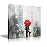
Opting for white as the backdrop for vibrant red accents not only minimizes risks but also maximizes the impact of the color scheme. The clean, crisp contrast between the white walls and the bold red elements creates a visually striking effect that instantly draws attention.
Moreover, the simplicity of the white background allows the red decoration items to take center stage, showcasing their vibrancy and adding dynamic energy to the room. Whether it’s red throw pillows, artwork, or accent furniture, each piece pops against the neutral backdrop, creating a cohesive and visually pleasing composition.
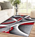
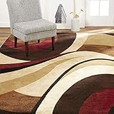
Gray is another popular color often paired with red. Undoubtedly, the elegance of gray blends beautifully with the strong and intense red, resulting in a visually pleasing appearance. This combination is particularly effective in modern or contemporary interior styles.
Any shade of gray can complement red excellently, offering flexibility to adjust according to your decor style and preferences. Whether you choose a light dove gray or a deep charcoal hue, the neutral backdrop of gray allows the vibrant red accents to command attention without overwhelming the space.
If you’re aiming to establish a connection between the wall and red decorations, then we highly recommend choosing blush. As a very light shade with a hint of red-orange hue, a blush-painted wall effortlessly complements any red items or furnishings while maintaining enough contrast to prevent the red hue from becoming overpowering.
Blush serves as an excellent backdrop for red accents, providing a soft and subtle base that allows the red elements to stand out without overwhelming the space. The delicate balance between blush and red creates a harmonious and visually appealing atmosphere, adding warmth and depth to your interior design.
At first, you may think that this combination won’t work well, as both yellow and red are two vibrant and striking colors. However, you can still achieve amazing results if you choose the right shades of yellow for your wall, such as this pale yellow.
This particular shade is much softer and lighter than the typical yellow, and that’s what makes it still look great when used alongside the vibrant and bold red. We love using this combination to add warmth and create a perfect visual balance for the entire space.
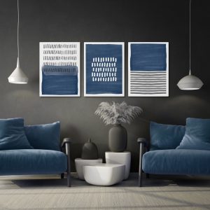
This is another interesting color scheme that you can use for your home. The vibrant yet serene quality of electric blue serves as a calming counterbalance to the boldness of red, creating a harmonious and balanced atmosphere.
Furthermore, the contrast between this striking blue shade and red enhances the overall visual impact of the room. The blue wall provides a striking backdrop that allows the red accents to pop, drawing attention to key elements and creating a focal point within the space.
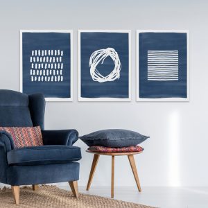
This is another excellent shade of blue that you can utilize to enhance the appeal of red accents. It serves as a dramatic backdrop that highlights the red accents, creating a dynamic and captivating focal point within the room.
However, it’s important to note that using this bold shade to paint your entire room may create a gloomy atmosphere. Therefore, it’s advisable to use it only as an accent wall.
Additionally, ensure that the room receives sufficient neutral lighting to balance out the bold colors and prevent the space from feeling too dark or overpowering.
Teal is an excellent choice for neutralizing the richness of your red decor. The calming nature of teal walls creates a perfect backdrop that softens the vibrancy of your red elements while still allowing them to shine as the centerpiece of your interior.
Moreover, teal has a calming effect, making it ideal for creating a relaxed and inviting atmosphere in any space. By incorporating teal walls alongside red accents, you can achieve a balanced and visually striking interior design scheme that is both elegant and welcoming.
If you are seeking a wall paint color that not only complements your red accents but also exudes warmth and creates a welcoming ambiance throughout your space, then we highly recommend you go with taupe.
Taupe is a versatile and sophisticated color that pairs beautifully with red accents, creating a cohesive and visually pleasing interior design scheme. Its warm undertones add depth and richness to the space, while its neutral hue provides a subtle backdrop that allows the red elements to stand out.
Caramel is a unique brown shade that offers a perfect blend of earthy, neutral tones with a touch of vibrancy. Pairing this shade with red can be a very intriguing approach to creating a lively and dynamic interior.
The combination of these two colors evokes a sense of warmth and richness, making the space feel inviting and comfortable. From living rooms to dining areas, bedrooms to home offices, this dynamic color duo infuses the space with energy and personality, making it a standout feature in your home décor scheme.
This is another great alternative for those who want to create an accent wall. The black accent wall will blend elegantly with red accents in the living room, resulting in a bold yet aesthetic look that will easily impress everyone.
Utilizing this powerful color combination can also make a strong statement about your bravery and style. Of course, using this combination entails some risks, but if done properly, the results will surely be worth it!

 Andre A | Founder
At Roomdsign, we lives and breathes interior design and home decor. We are committed to sharing knowledge, insights, and inspirations with our global audience through engaging and informative blog posts.
We also empower readers with our practical tips, design trends, and imaginative ideas for a stylish and functional living spaces.