
Black Fox
(SW 7020)
A gold picture frame not only beautifully showcases your cherished family photos and artwork, but also serves as an eye-catching addition that introduces the elegance of gold accents to your home.
However, to truly make the gold frame truly shine, it needs to be paired with the right backdrop, or in other words, the right wall color. The right color can help boost the stunning metallic charm of the frame, and unleash its full potential.
From our experiences, some of the best wall color options for gold picture frames are charcoal, navy, brown, or medium gray. Those paint colors will be a stunning canvas that highlights the luxurious appeal of the gold frames, and help the frame to stand out as captivating accent pieces that enhance your space’s overall aesthetics.
Read on for a complete list:
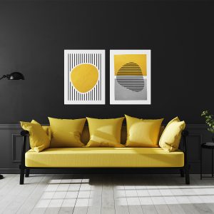
When we working on a project that involves some gold accessories, then this is one of the first wall color choices that we offer to our client, especially if there is a possibility to create an accent wall.
As you can see in the picture above, the frames look amazing against the dark-toned charcoal wall. Not too much contrast between them, but the gold element still stands out beautifully.
Moreover, the elegance of this paint color will enhance the glamorous looks of the frames, providing a luxurious visual appearance.
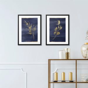
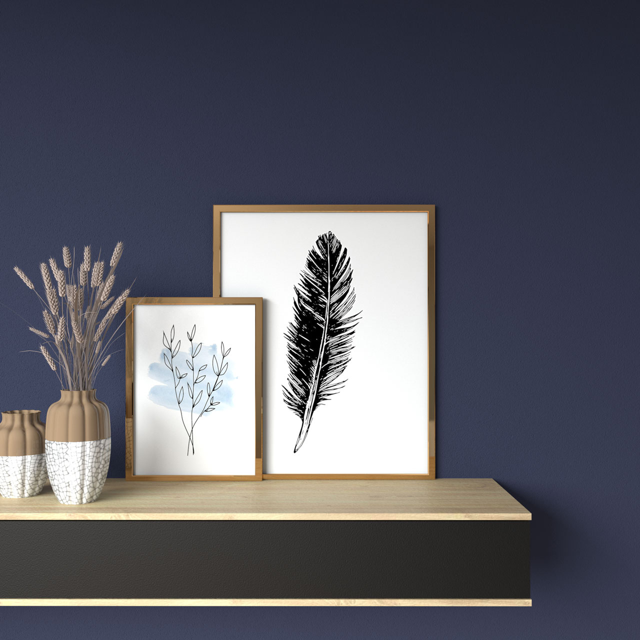
Navy is another amazing bold choice that works nicely with the gold frames. The cool, deep-toned navy wall serves as an elegant background to enhance the vivid gold items.
Same with the previous choice, this paint color may only work best as an accent wall, but still, it can create a wonderful wall that showcases all of your favorite photographs or artwork highlighted in the dazzling frames.
For any of you who prefer a more subtle and light choice, then ivory may be a perfect choice.
This color had plenty of warmth that is needed to balance the gold, while at the same time bringing a beautiful contrasting effect to make these elements stand out more.
It’s quite difficult to find any colors that can look seamless with gold, and that’s why going to contrast with it is much preferable.
However, if you still want to have a harmonious look throughout your spaces, then you can try this light taupe.
Visually, it had some similarity with the gold, and that’s what makes them look flawless when used together.
Let’s go back to the bolder choices, and this time, we want to recommend this gorgeous color, brown.
The brown wall can be very useful to match the strong visual appearance of the gold frames, especially if you don’t want the frames become too dominant.
This combination is unique and we love it! Especially since most green shades won’t work really well against any metallic elements, you can use this beautiful shade to bring the freshness and natural vibe as any typical green, but still match perfectly with the glam looks of the gold picture frame.
As a neutral, gray can be a perfect base to bring all of the potential of any vibrant and vivid elements like gold. All shades of gray can work really well, but if we had to choose one, we tend to go with any medium to dark-toned gray.
However, only use any dark gray paint if you have a sufficient amount of natural lighting, while for a darker room, light gray is surely a wiser choice.
In most cases, white obviously the best choice that can go with any color or element. However, things can be a bit different when it comes to gold, as there are many better options that we already listed in this article.
That said, you can still use this color to paint the wall behind your gold frames as it still looks quite good. As you can see in the image above, the plain white wall is providing a crisp and clean base to let the luxurious frames be the star of your walls.

 Andre A | Founder
At Roomdsign, we lives and breathes interior design and home decor. We are committed to sharing knowledge, insights, and inspirations with our global audience through engaging and informative blog posts.
We also empower readers with our practical tips, design trends, and imaginative ideas for a stylish and functional living spaces.